[2D Texture] More realistic mini-maps?
Posted: 2011-12-19 23:09
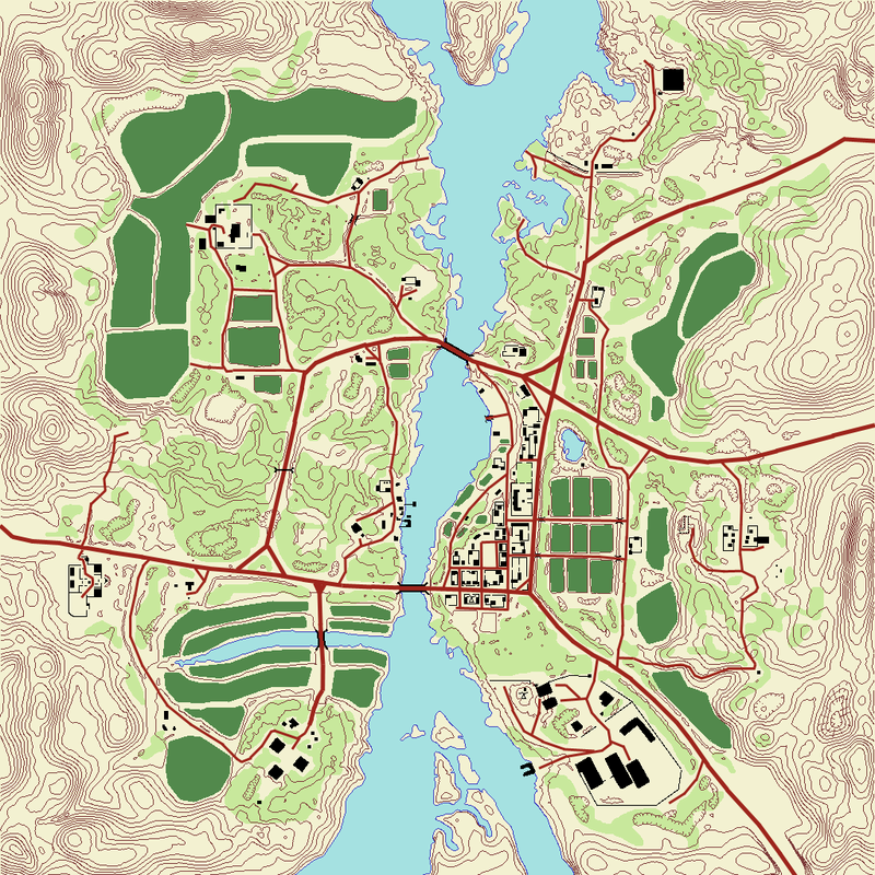
The maps (overview / minimap, not the level) are one of my biggest pet peeves in PR, because of their gamey and unrealistic look. They don't look much like real photographs and could use some color correction to make them look cooler 
Also, having the maps less saturated with bright colours would bring up the icons more.
This is suggestion-ish but more of an overall question: Do you guys think that the current maps look good or should they be tweaked a little to represent real photographs?
Below is an example of what I'm talking about; in-game map, edited version of that and a real satellite image of Muttrah. Let me know what you think, if people like it, it wouldn't be a big task to do it on every map.
