Page 1 of 4
[HUD] Communication Rose Overhaul
Posted: 2009-09-17 14:25
by AncientMan
Most people were probably a bit confused when I posted this
developer blog a while back. Now that I've got something to show, I might ease that confusion and show you all some screenshots of the new commo rose that myself and [R-DEV]Chuc are making for PR v0.9.


It's all WIP, some small things will probably change for the final version

.
Re: Communication Rose Overhaul
Posted: 2009-09-17 14:28
by Rudd
Very nice change, looks professional and informative
edit..
what camo is that? looks different.
Re: Communication Rose Overhaul
Posted: 2009-09-17 14:33
by foxxravin
Wow, nice! looks very good
Re: Communication Rose Overhaul
Posted: 2009-09-17 14:42
by rampo
HOT! would be so cool if you could customize the color yourself but still HOT!
Re: Communication Rose Overhaul
Posted: 2009-09-17 14:46
by J.F.Leusch69
looks great,....sooo much different than vbf2!
good job!
Re: Communication Rose Overhaul
Posted: 2009-09-17 14:59
by StuTika
OK that looks
really good!
Re: Communication Rose Overhaul
Posted: 2009-09-17 15:01
by Kranich
It is a good improvement
Very nice work
Re: Communication Rose Overhaul
Posted: 2009-09-17 15:02
by Gore
Woah looks really modern-like. Soon there won't be any traces of BF2, keep it up! Nice work.
Re: Communication Rose Overhaul
Posted: 2009-09-17 15:14
by DankE_SPB
will it be offset from centre of the screen?
you already removed reticle from binos but its still possible to aim with commo rose
Re: Communication Rose Overhaul
Posted: 2009-09-17 15:32
by Mad-Mike
lookin ten times better than the bf2v one we have atm.
Good work mate keep it up
Re: Communication Rose Overhaul
Posted: 2009-09-17 15:38
by single.shot (nor)
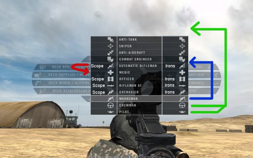
this is really nice and clean-looking. it would be nice to have left-click-scopes, right-click-irons and show those off as another "sidebar" on the menu with a scope pictogram on the left and a "irons"-pictogram.
i would suggest re-arranging the way the classes appear as indicated below.
top to bottom, as suggested:
Crewman
Pilot
HAT
Sniper
AA
Engineer
Medic
Officer
LAT
Grenadier
Marksman
this way, the 5 specialised classes will be on top, and the 2 supportive below that, and then the "squad-kits", starting with the officer. this is more or less useless, but maybe stupid people like me, will understand better if the kits are arranged after what they are used for...
like this: (with some nice looking PRish pictogram instead of text... maybe an M16-style carrying handle in white for irons, and an Acog in white for the scope side)
Re: Communication Rose Overhaul
Posted: 2009-09-17 16:06
by Zrix
Looking good
And I agree with single.shot (nor), sounds like a good idea.
Re: Communication Rose Overhaul
Posted: 2009-09-17 17:08
by =Romagnolo=
The little symbols are great ! Nice idea and very well done guys, you all are awesome ! I s2 u
Re: Communication Rose Overhaul
Posted: 2009-09-17 17:09
by Claymore
Excellent imprevements, the icons are also a good idea.
Re: [HUD] Communication Rose Overhaul
Posted: 2009-09-17 17:23
by General Dragosh
OMFG O.O *droll*
That is . . . . *falls over from excitement*
Re: [HUD] Communication Rose Overhaul
Posted: 2009-09-17 17:31
by jbgeezer
This is quite hot, I like the illustrations
Re: [HUD] Communication Rose Overhaul
Posted: 2009-09-17 17:45
by cyberzomby
Awesome work as ever I must say!
Re: [HUD] Communication Rose Overhaul
Posted: 2009-09-17 18:18
by Outlawz7
Could remove the extra space next to the kit icons, but overall wtfpwn.
Re: [HUD] Communication Rose Overhaul
Posted: 2009-09-17 18:47
by akatabrask
Wow that is looking sweet.
One step further away from vanilla indeed.
I also agree with single.shot about being able to choose between scope/irons but that's another discussion.
Re: [HUD] Communication Rose Overhaul
Posted: 2009-09-17 18:48
by Dizakui
That looks really amazing. The symbols fit in really well, and it looks professional.
This keeps on looking better and better.
Great job
Edit: after looking at it again there is one small thing. On the actual kit request I'd suggest moving the text across so theres less space between the edge and the symbol, and maybe putting the ironsights symbol on the right of the text for the kits where you right click to get iron sights. Sortof like what single.shot said.