Rambo Hunter wrote:
what do you all think? (still novice photoshopper, be nice!)
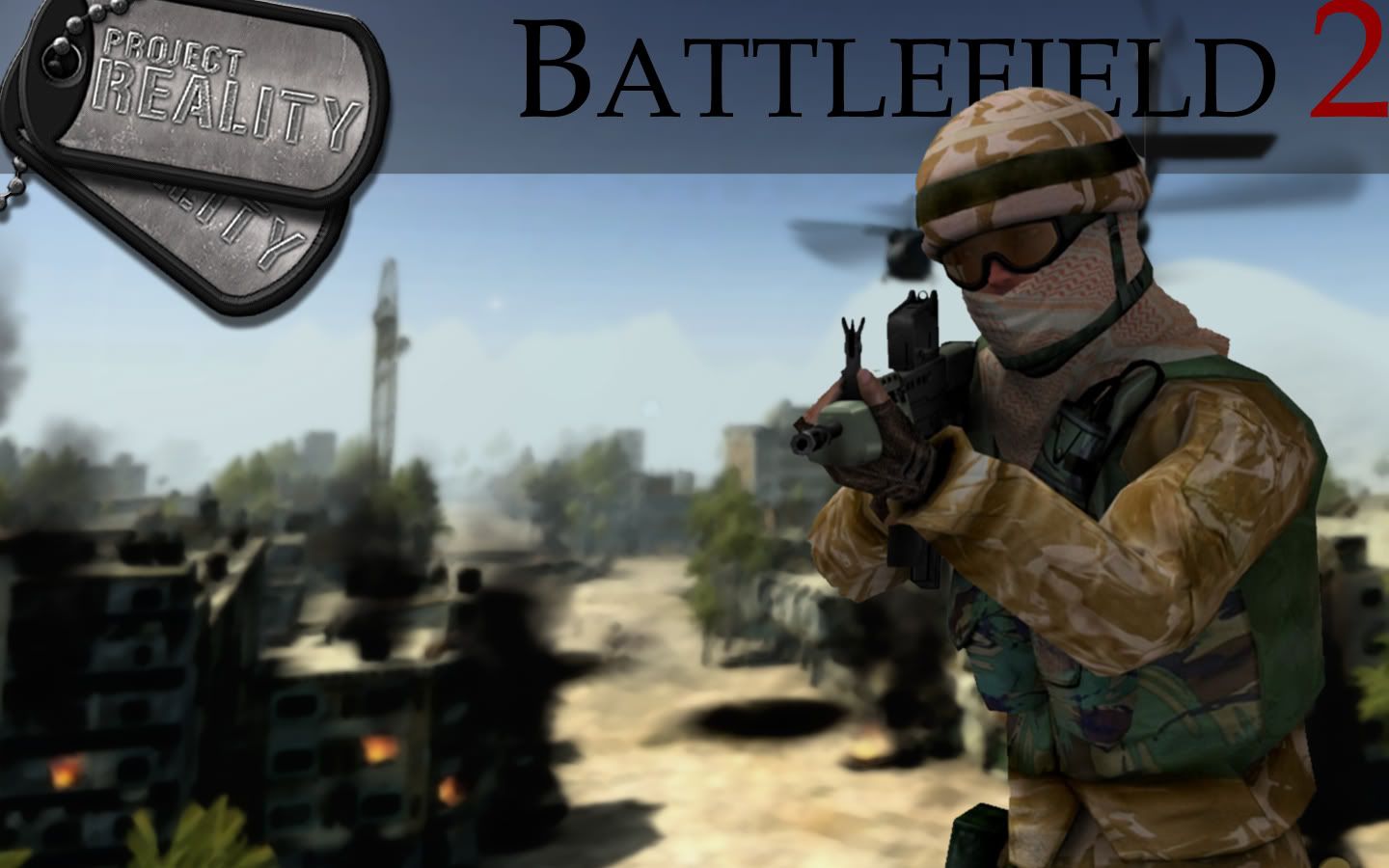
i like em. some very easy things that you can do to give your images more depth (besides just blur tool): i always love darkening the edges. simple thing, but it works awesome. cut the corners a little bit and reduce your fill for your paint brush to 1-2% and just paint the edges. always reduce the fill of everything. working at 100% fill is just way too hard. i used to do it when i first started, and i made things a lot harder on myself.
also, i know its a pain (i absolutely hate this), but cutting out images has to be exact. that never gets more fun haha. you just have to take it slow and use the geometric lasso selection tool (dont use lasso, magnetic lasso, or magic wand for things that are in the foreground. they will come out pixel-y and you will miss some things / include things you dont want. if the object is in the bg, you can get away with using magic wand or magnetic lasso since youll be blurring them anyway).
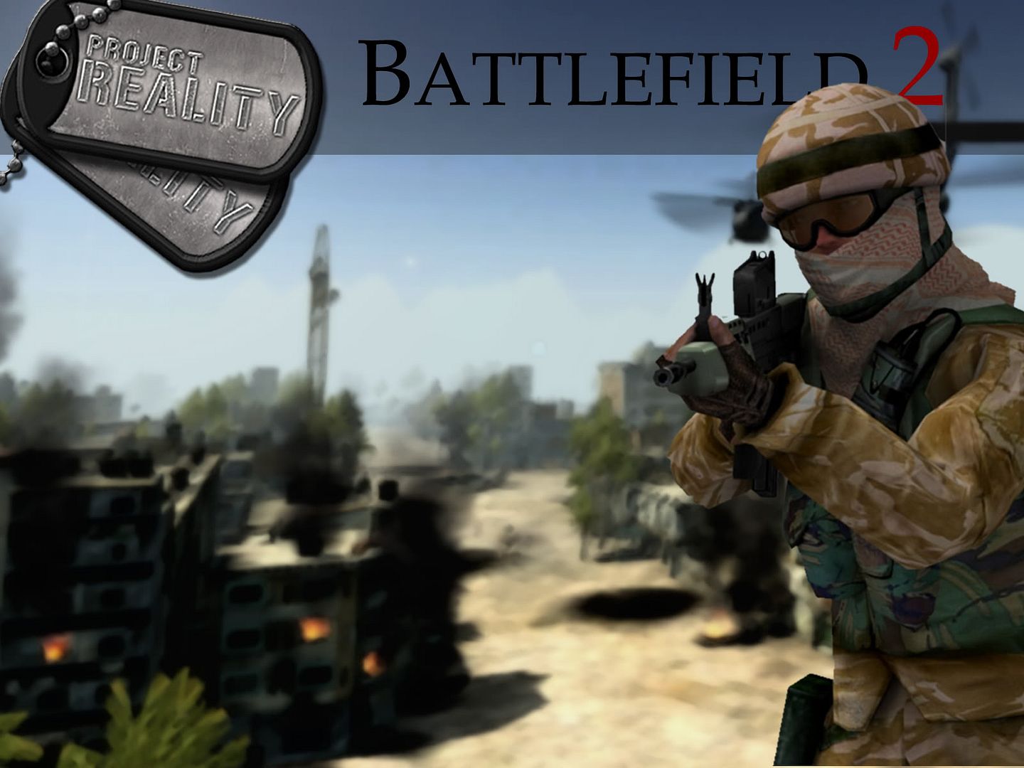
for the logo, where it says "battlefield 2": try using sans serif fonts. since this is supposed to be an image that is going to attract attention, you want the title to be as easy to read as possible. 90% of the time, i use sans serif, just because its so easily recognizable. if you look at most magazines, you will find that they use sans serif fonts on the cover (obviously this isnt always true -- TIME magazine's title doesnt, but for most magazines its true). this is also true of video games (do a search of "video game cover" on google images).
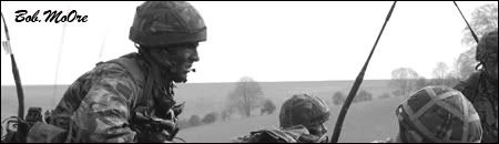
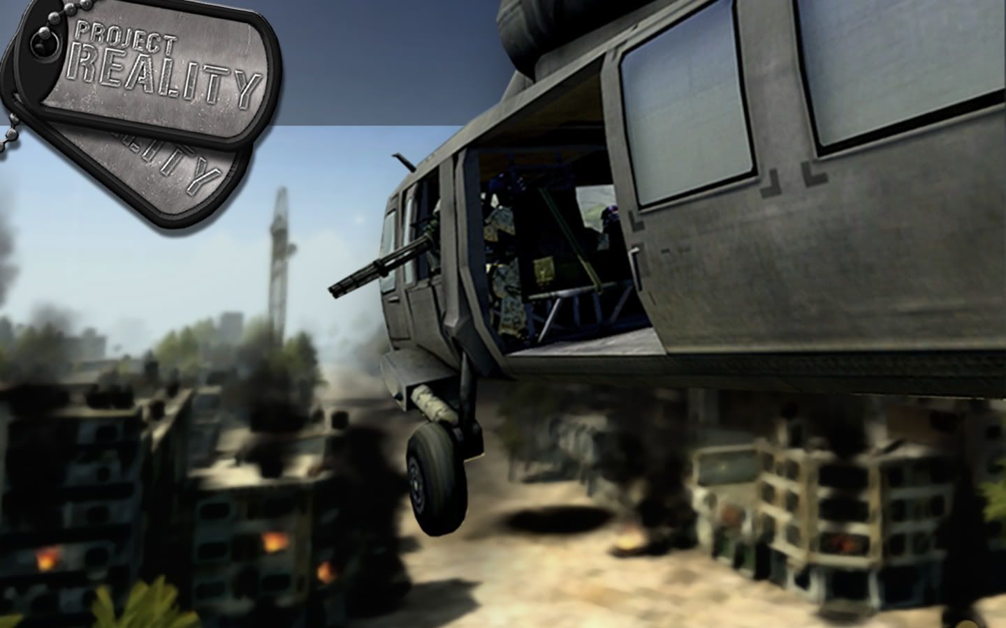
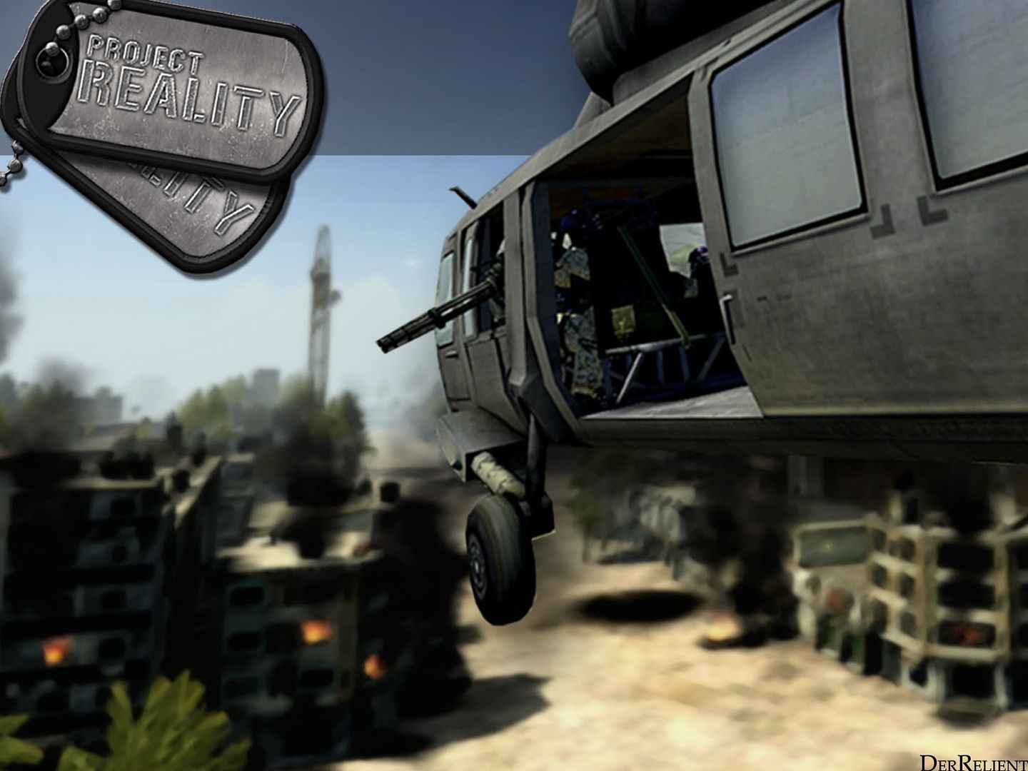
anyway, things i think you definitely did right: the basic layout is great. especially in the one with the british soldier. it is very balanced and its really good that you know that you dont have to put everything in the middle and symmetrical to have it be balanced (an obsession i used to have). also good is the top border -- the transparency really works well to offset the dogtags and title. the image is blurred well also.
my personal preferences: only a few things here. 1) try and avoid filters. they look cool and can be useful (the texture > grain tool is a popular one i use), but try and get as far as you can without them. 2) the background choice for the soldier doesnt really make sense with the soldier -- he looks like hes floating, but thats probably my obsession with realism. if you look at video game covers like special forces, you can see that having the setting match the foreground isnt necessary. 3) dont be afraid of a large file. i've had magazine covers get to be a quarter of a gig (no lie). duplicate any layer you have the small chance of needing later.
anyway, thats all, hope you find what i said helpful. you may know a lot of it, but i thought i'd include it for any people curious about photoshop.
anyway, here are my new ones. insurgent class:
normal:
http://www.diapause.org/hocclan/insurgentspr.jpg
widescreen:
mods, let me know if i should post these in a diff thread. this thread is kind of dead, i bumped it from 4 pages back, but i said i'd give feedback so i had to do that. but yeah let me know fo sho

edit: woops! forgot to take out the explosion things from the wide screen version. ill update it tomorrow, im tired. ive been working on that for like 3 hours (off and on, but still) haha. another edit: yeah that widescreen version has a lot of issues. im taking it off, i gotta fix that tomorrow.
also, do you guys think i should do mec and china wallpapers? dont know if anyone will actually use them.
and im planning on doing a wallpaper for each kit, so all you snipers, heavy at's and squad leaders can have your own wallpapers for your role in the squad. fa real.


