
[Map] bujhaldaj [scrapped]
-
Mora
- Posts: 2933
- Joined: 2007-08-21 12:37
Re: [MAP] bujhaldaj --> Whats the opinion of the devs?
But one attack chopper wouldn't hurt right? 

-
Sabre_tooth_tigger
- Posts: 1922
- Joined: 2007-06-01 20:14
Re: [MAP] bujhaldaj --> Whats the opinion of the devs?
Too much I think also, just a heli at all will be significant. Littlebird is good because its so vunerable. Just because you have a helipad, etc you dont have to populate it, just makes a nice setting I think.
Often airbases and so on are the first points bombed by enemies when invading, etc. That'd be cool to see, a big runway completely wrecked like the way you have some of your city buildings
I'd love to see some action based around the basra airport building and the car park building, great for firefights and overwatch
-
agentscar
- Posts: 1266
- Joined: 2007-06-25 04:26
Re: [MAP] bujhaldaj --> Whats the opinion of the devs?
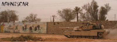
A Cobra/Apache on this map would PWN!!!!
Urban maps these days lack the proper assets..In RL,Tanks,and attack helo's are all you see in urban fights..
This map PWNS!
Urban maps these days lack the proper assets..In RL,Tanks,and attack helo's are all you see in urban fights..
This map PWNS!


-
Hans Martin Slayer
- Retired PR Developer
- Posts: 4090
- Joined: 2007-01-21 02:20
Re: [MAP] bujhaldaj --> Whats the opinion of the devs?
sorry for the delay, like i told you i've been busy with other stuff..
anyways, as promised, some basic feedback.
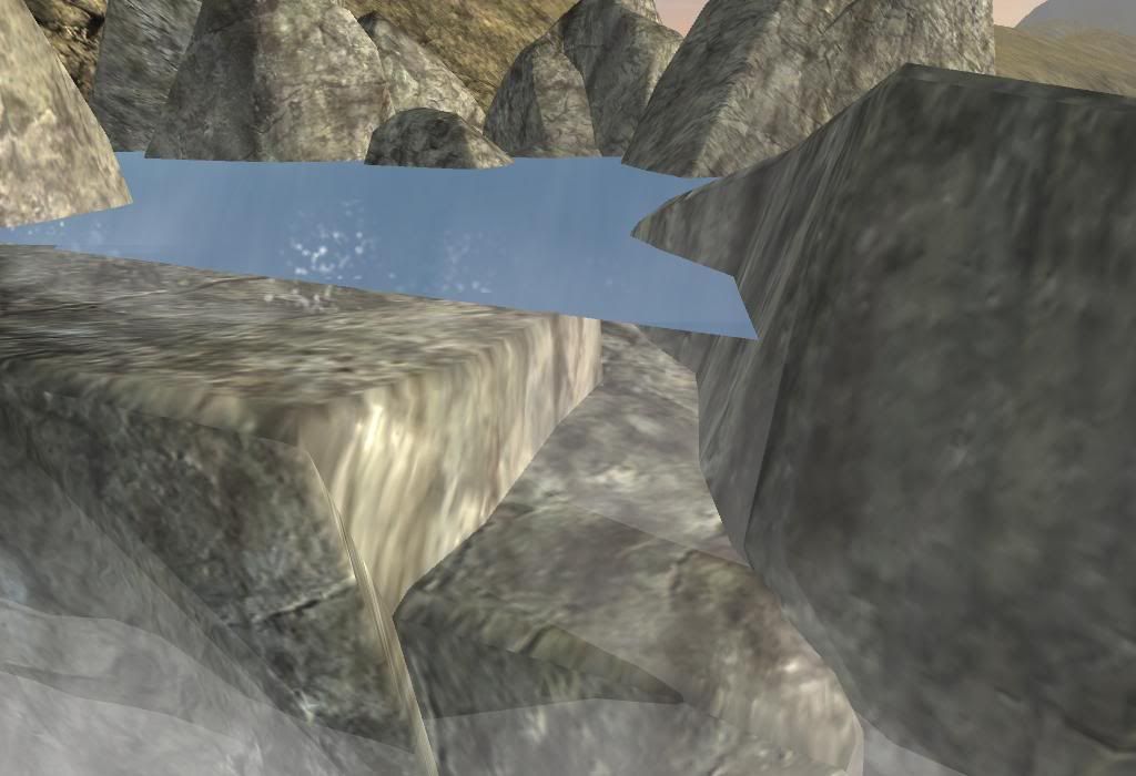
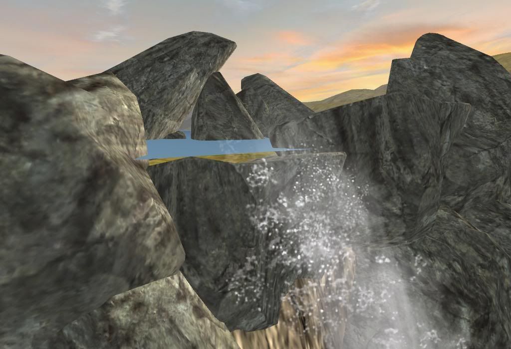
nice idea with the waterfalls, just make sure your waterplanes don't float, wich is pretty much all of them atm.
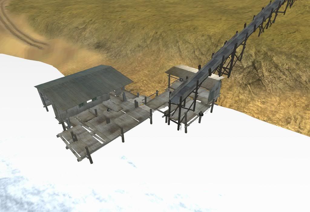
nice idea with the tunnel as well, but the conveyer belt going straight into the closed door looks wrong.
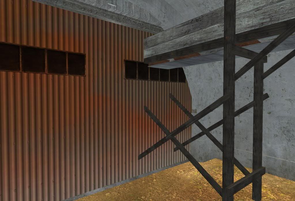
also, why does the conveyer end here, doesn't make sense to me.
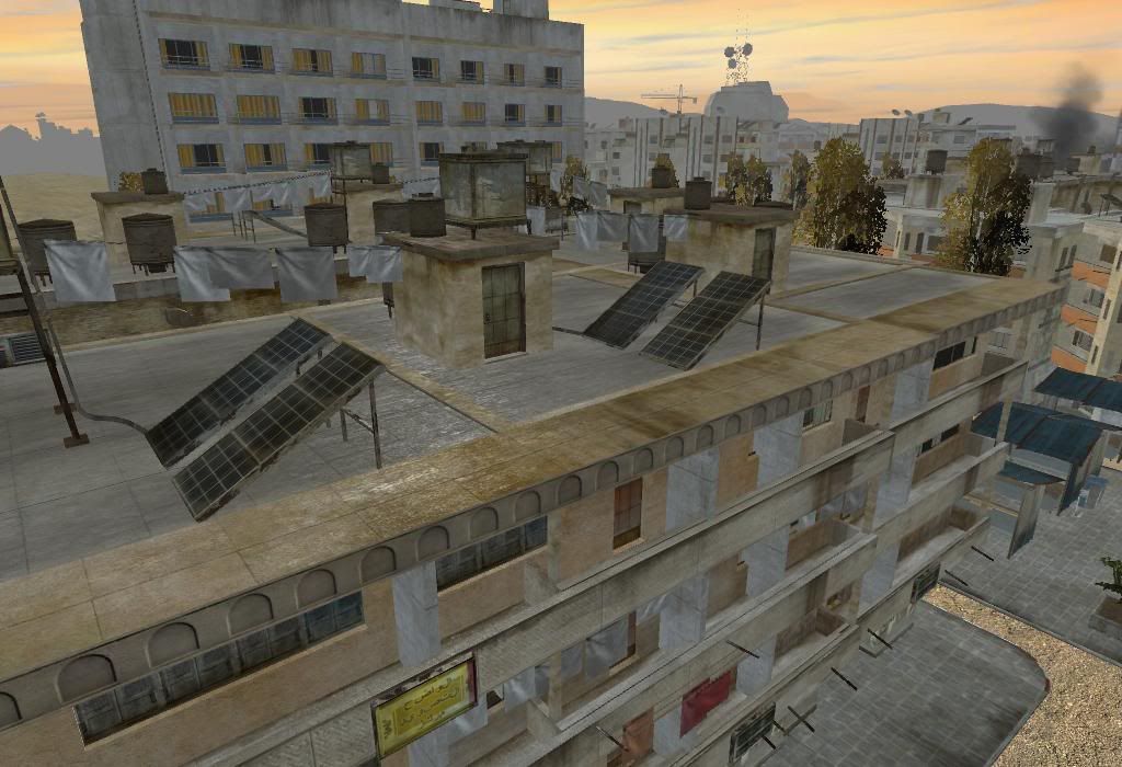
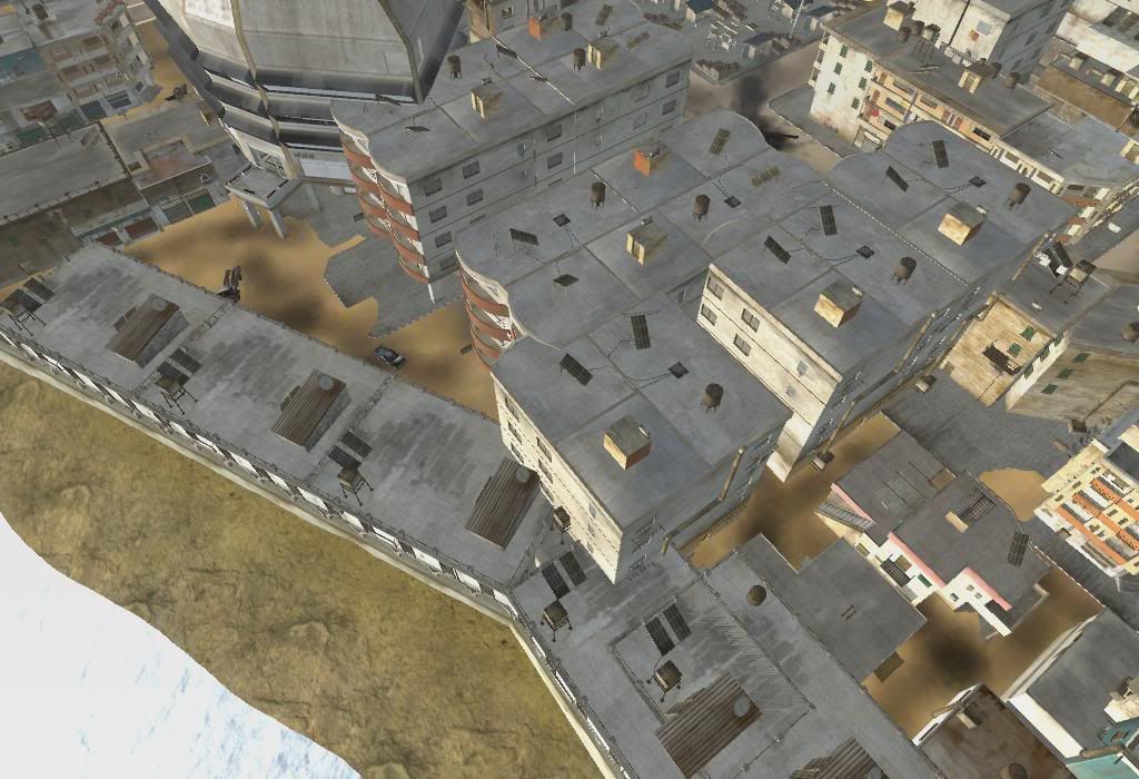
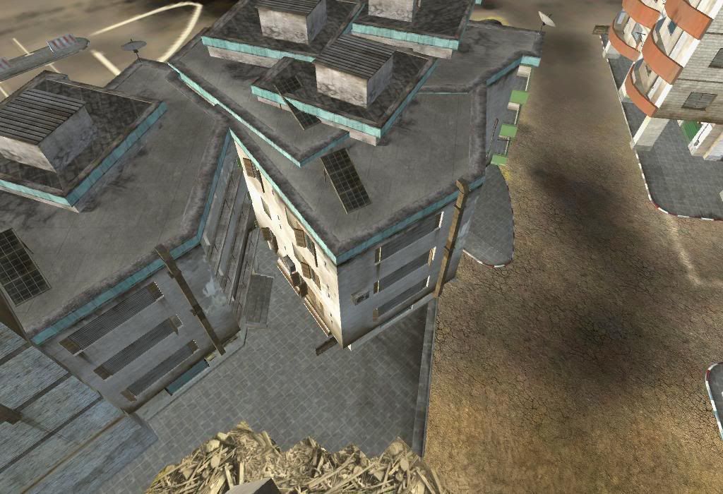
next major issue: you shouldn't stick all those statics into each other, it's fine to a certain degree, but it's just way too much on your map. the result is z-fighting (statics flickering through each other), not too mention it looks wrong:
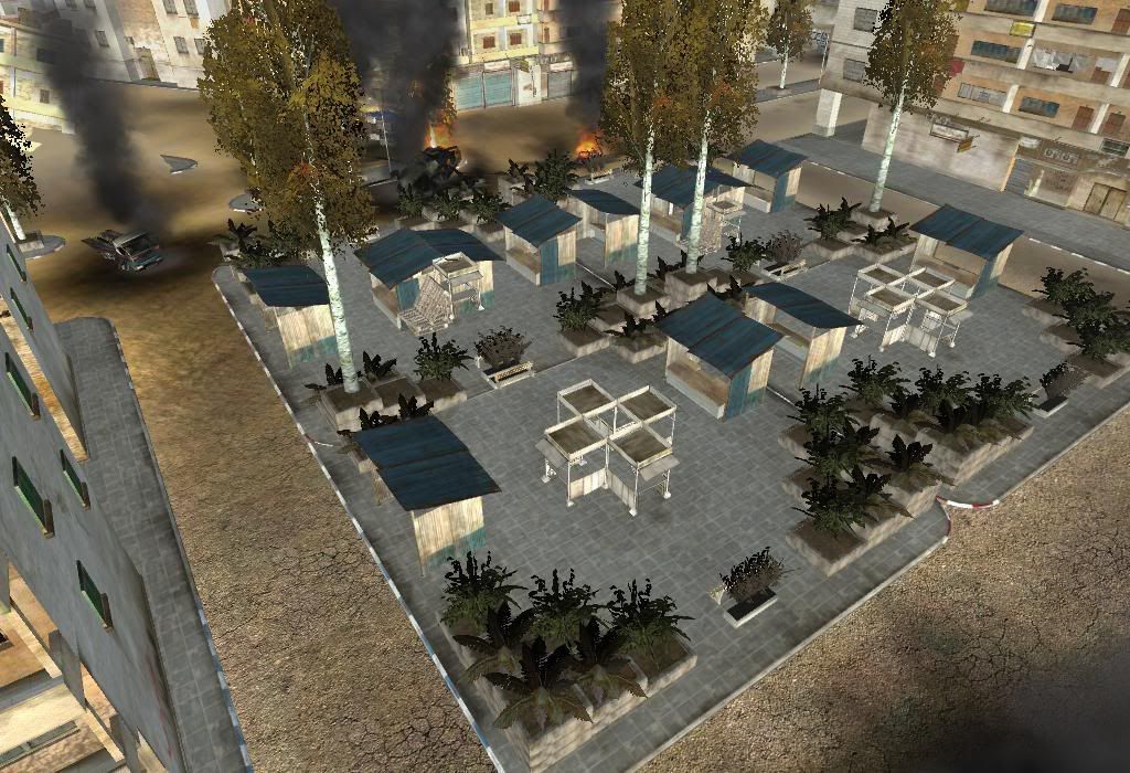
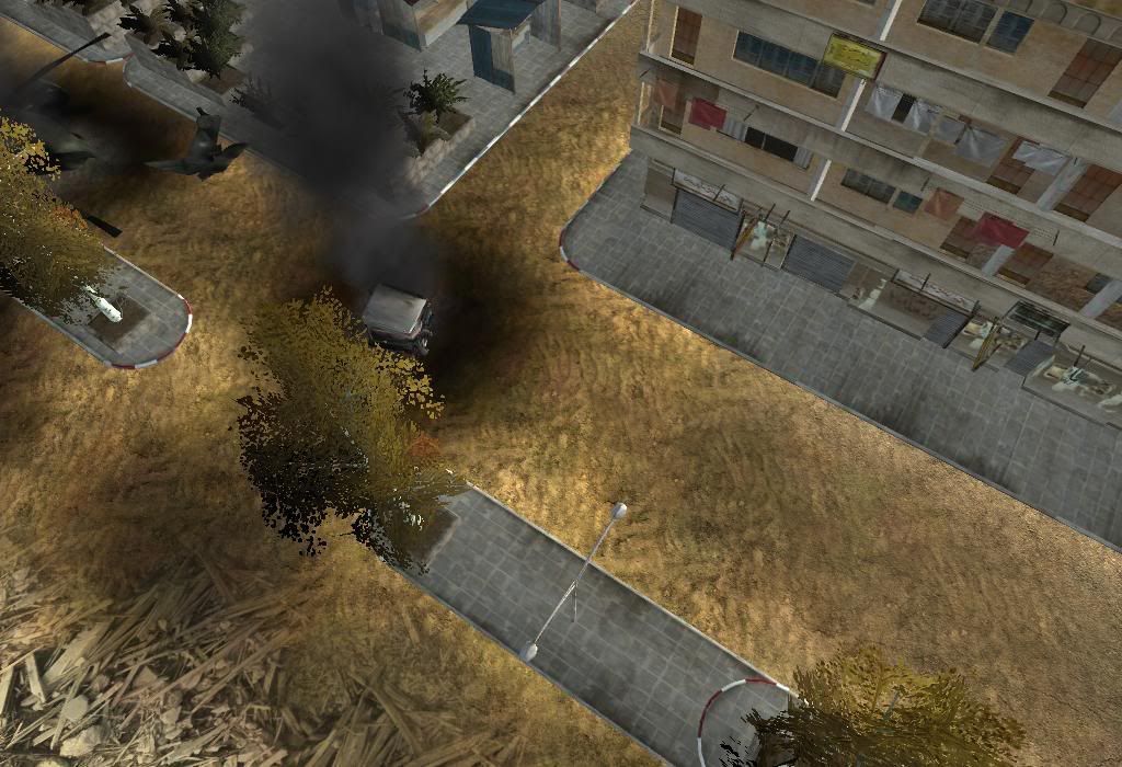
i like the idea of those plant boxes, it's just too much imho, less might be more:
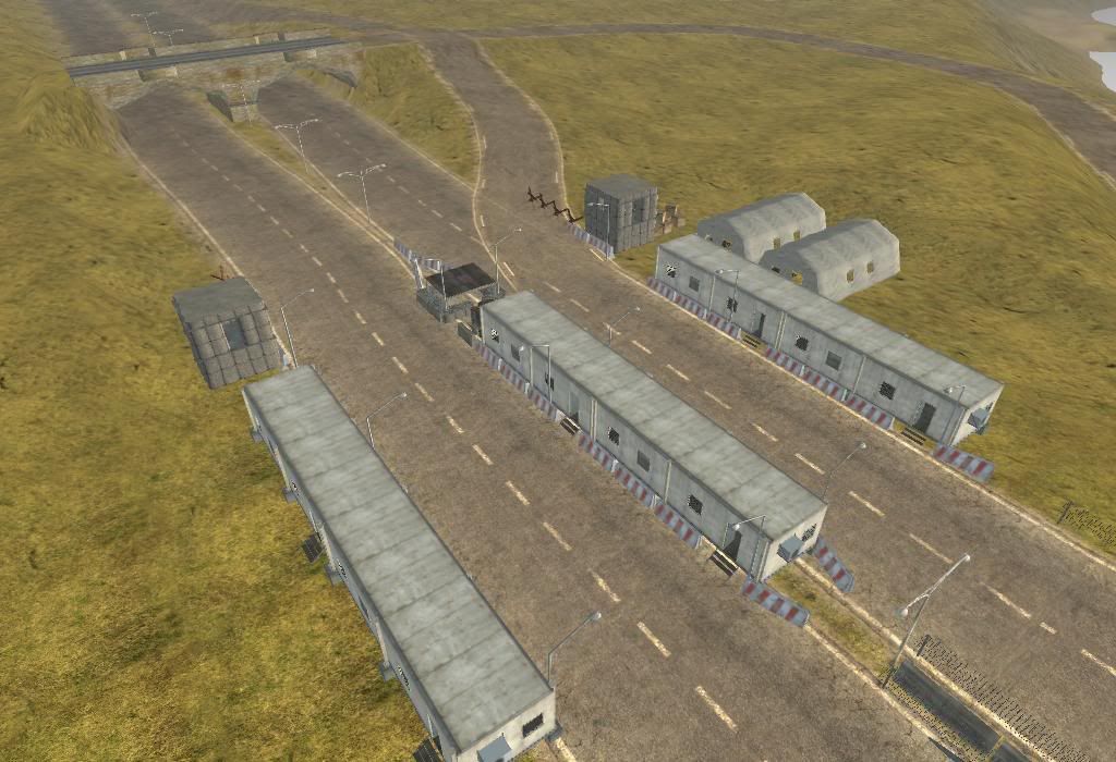
nice job here so far, just try to use road intersections wherever possible:
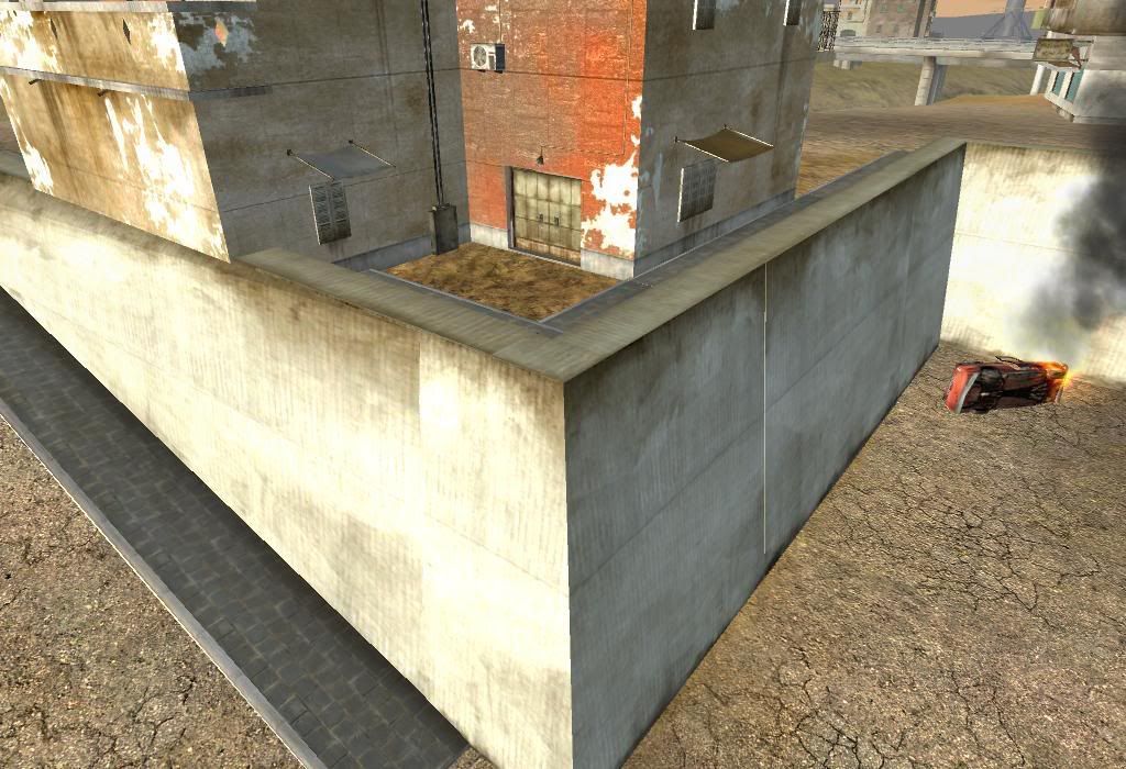
bad static allignment here as well, looks wrong and you've got z-fighting, too. make sure you join all walls correctly:
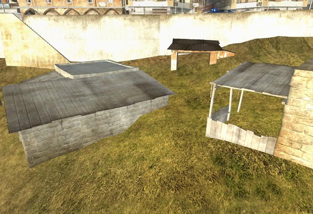
statics sunken into the ground, looks wrong:
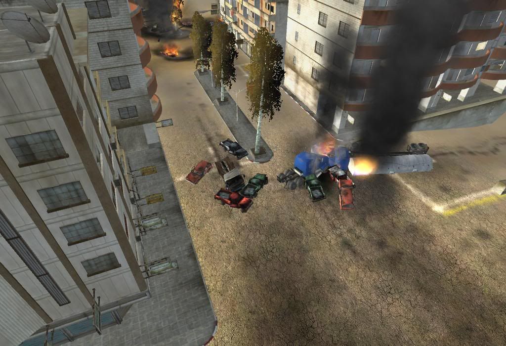
again, this is too much imho, why should like 8 vehicles crash into each other like that, at an intersection like that?
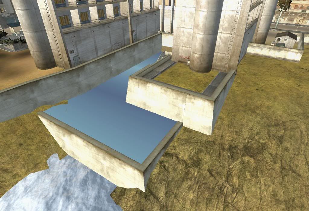
i take it, this is supposed to be the hotel pool? i would use the pool statics instead, looks very odd that way.
beach texture looks very out of place here:
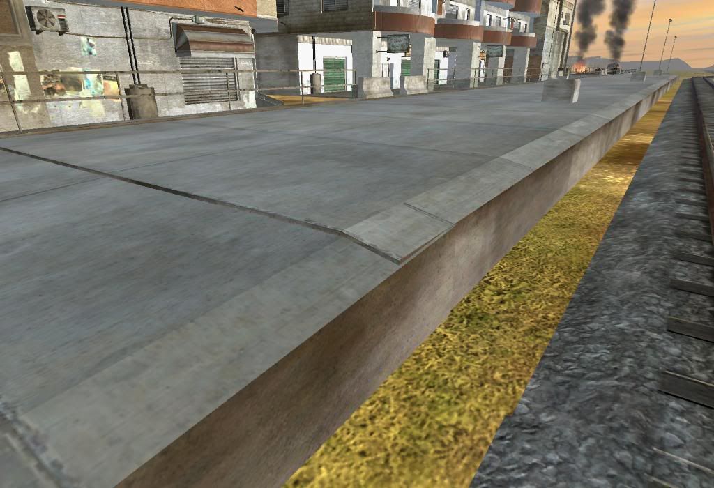
nice idea with the train platform, just doesn't look right that way, maybe you're able to join it better, or maybe use stairs instead of making a ramp?
i take it this is wip?
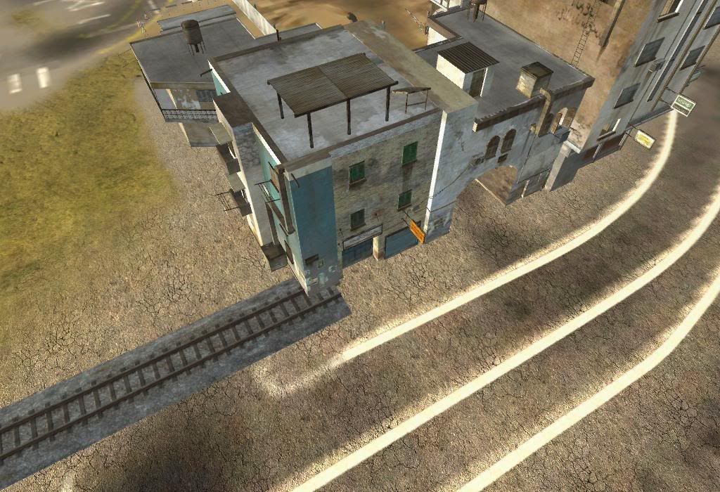
nice idea again, with the traintracks sunken into the ground. but when looking from high up, you see the tracks through the terrain:
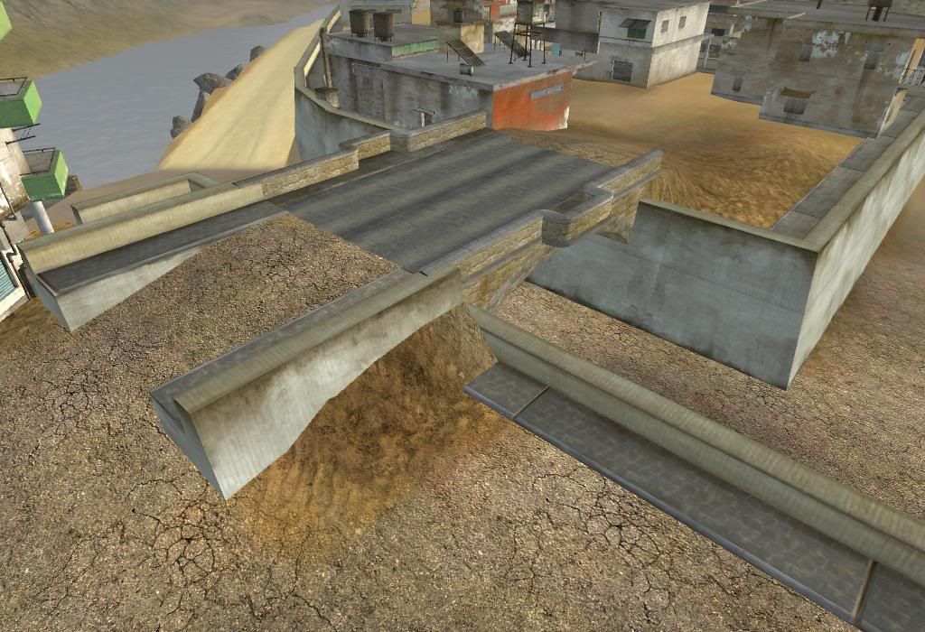
the bridge looks very out of place imo:
still many many other things to do, but i hope this helps a bit for now..
anyways, as promised, some basic feedback.
nice idea with the waterfalls, just make sure your waterplanes don't float, wich is pretty much all of them atm.
nice idea with the tunnel as well, but the conveyer belt going straight into the closed door looks wrong.
also, why does the conveyer end here, doesn't make sense to me.
next major issue: you shouldn't stick all those statics into each other, it's fine to a certain degree, but it's just way too much on your map. the result is z-fighting (statics flickering through each other), not too mention it looks wrong:
i like the idea of those plant boxes, it's just too much imho, less might be more:
nice job here so far, just try to use road intersections wherever possible:
bad static allignment here as well, looks wrong and you've got z-fighting, too. make sure you join all walls correctly:
statics sunken into the ground, looks wrong:
again, this is too much imho, why should like 8 vehicles crash into each other like that, at an intersection like that?
i take it, this is supposed to be the hotel pool? i would use the pool statics instead, looks very odd that way.
beach texture looks very out of place here:
nice idea with the train platform, just doesn't look right that way, maybe you're able to join it better, or maybe use stairs instead of making a ramp?
i take it this is wip?
nice idea again, with the traintracks sunken into the ground. but when looking from high up, you see the tracks through the terrain:
the bridge looks very out of place imo:
still many many other things to do, but i hope this helps a bit for now..
-
marcoelnk
- Retired PR Developer
- Posts: 1581
- Joined: 2007-03-03 11:30
