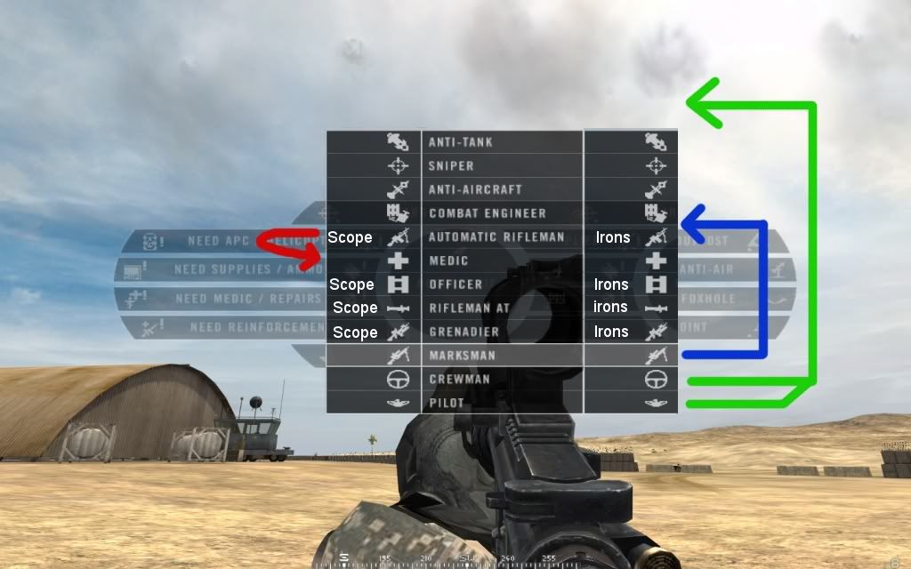
this is really nice and clean-looking. it would be nice to have left-click-scopes, right-click-irons and show those off as another "sidebar" on the menu with a scope pictogram on the left and a "irons"-pictogram.
i would suggest re-arranging the way the classes appear as indicated below.
top to bottom, as suggested:
Crewman
Pilot
HAT
Sniper
AA
Engineer
Medic
Officer
LAT
Grenadier
Marksman
this way, the 5 specialised classes will be on top, and the 2 supportive below that, and then the "squad-kits", starting with the officer. this is more or less useless, but maybe stupid people like me, will understand better if the kits are arranged after what they are used for...
like this: (with some nice looking PRish pictogram instead of text... maybe an M16-style carrying handle in white for irons, and an Acog in white for the scope side)
War is a huge matter for a nation. it's the field of life and death, destruction and survival, and such matters cannot be left unstudied. - Sun Tzu